Statistik

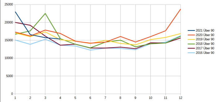
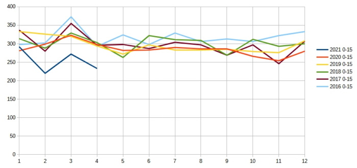
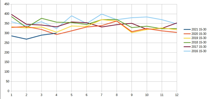
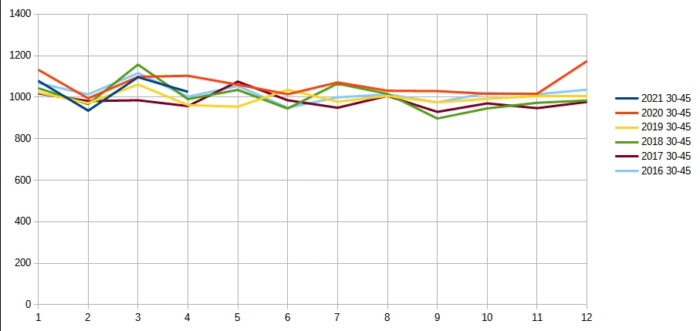
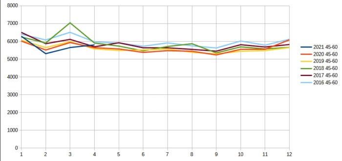
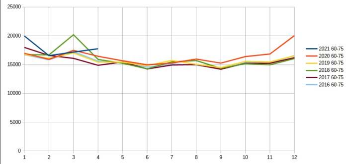
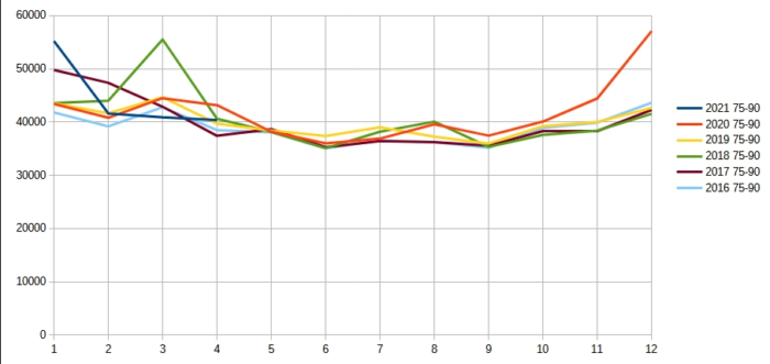
Das Statistische Bundesamt veröffentlicht weiterhin wöchentlich seine Zahlen zur Sterblichkeit während der Corona-Pandemie. Im Folgenden wurden die Daten für alle Altersgruppen graphisch aufbereitet. Man sieht so am besten, für wen “Corona” eine lebensgefährliche Bedrohung darstellt und vor allem: für wen nicht.

In allen Graphiken sind die “Coronajahre” 2020/2021 als rote bzw. blaue Linien dargestellt. Die anderen Linien zeigen die Vorjahre zum Vergleich. Auffällig ist hier nur das Grippejahr 2018 in Grün.

Altersgruppe bis 15 Jahre

Altersgruppe 15 bis 30 Jahre

Altersgruppe 30 bis 45 Jahre

Altersgruppe 45 bis 60 Jahre

Altersgruppe 60 bis 75 Jahre

Altersgruppe 75 bis 90 Jahre

Altersgruppe über 90 Jahre

22 Kommentare

  1. I found your weblog website on google and check a couple of of your early posts. Continue to maintain up the superb operate. I just further up your RSS feed to my MSN News Reader. Seeking forward to studying more from you later on!…

  2. Thank you for sharing excellent informations. Your web site is very cool. I am impressed by the details that you’ve on this blog. It reveals how nicely you perceive this subject. Bookmarked this website page, will come back for more articles. You, my pal, ROCK! I found simply the info I already searched all over the place and simply couldn’t come across. What an ideal web site.

Schreib einen Kommentar

Deine E-Mail-Adresse wird nicht veröffentlicht.